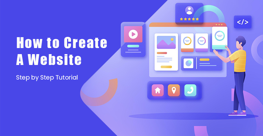
Web Design Layouts Creation: A Step-by-Step Guide
Creating a web design layout could prove to be a rather tricky proposition for beginners, but given that the process is an intrinsic part of web design, it is essential to learn web layout creation. Scientific layout creation allows good user experience, support for content to render, and achievement of website aims. Verily, the more you know about planning and creating a layout, the more engaging and usable your site will be, whether you’re designing a personal blog or a corporate site. Here is a step-by-step guide to assist in the art of designing your own perfect web layout.
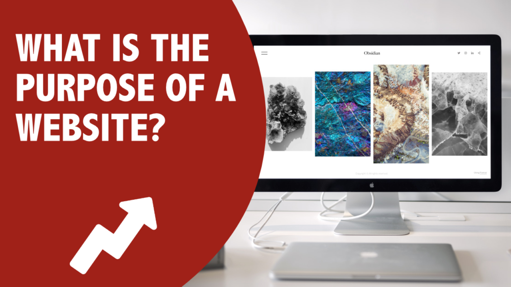
1. Define the Purpose of Your Website
Before you whip out that pencil and start sketching the design, start by having a defined clear picture of what purpose your website will serve. Ask yourself:
What is the website’s main purpose? (Informational, e-commerce, portfolio/directory, etc.)
Who is my target audience?
What actions do I want users to take on my site? (Purchase, sign up for a newsletter, read blog posts, etc.)
Once you have these questions answered, it will surely help you come up with a layout that favors those objectives.
2. Research and Analyze Other Websites
Go take a look at some websites that are kind of close to yours. Make a note of their design elements, structure, and user engagement. Researching other sites can help you find trends and gain valuable insights for your very own layout. Make sure to check websites for your niche as well for what works best for your audience.

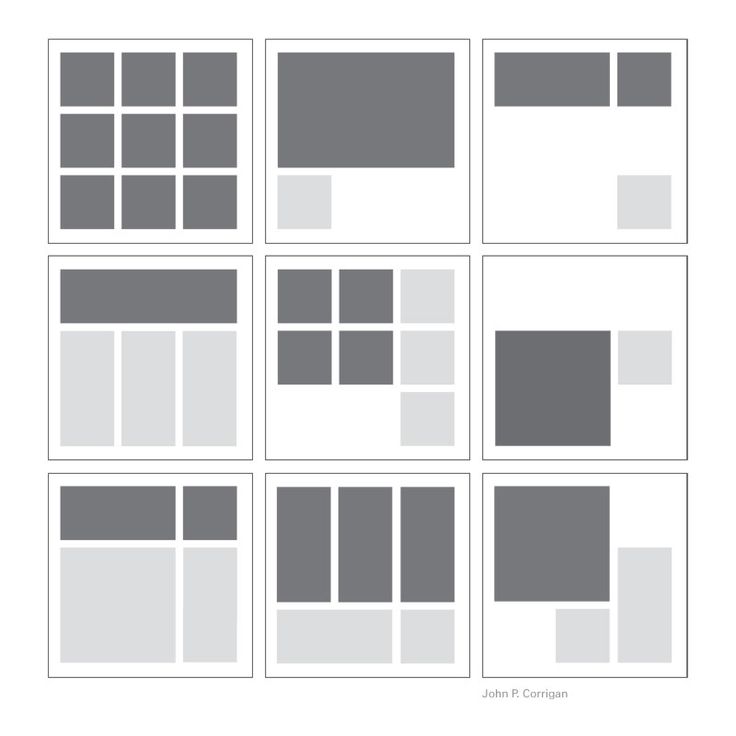
3. Choose a Layout Style
The Website can choose from different layout types depending on the contents and goals of the site. Some of the more popular layout styles are:
F-Layout: Commonly for blogs and articles. The content is arranged into an F shape with the most important elements in the top left quarter of the page.
Z-Layout: Suitable especially for lesser content sites or those with a clear call-to-action such as landing pages or product pages.
Grid Layout: A grid-based layout works best for e-commerce styles or portfolios that are heavy on images to keep their contents neat and structured.
Single-Column Layout: Works well for minimalist designs or when attention needs to be concentrated on a particular action or content type.
Choose a layout style that does justice to your content while allowing easy navigation.
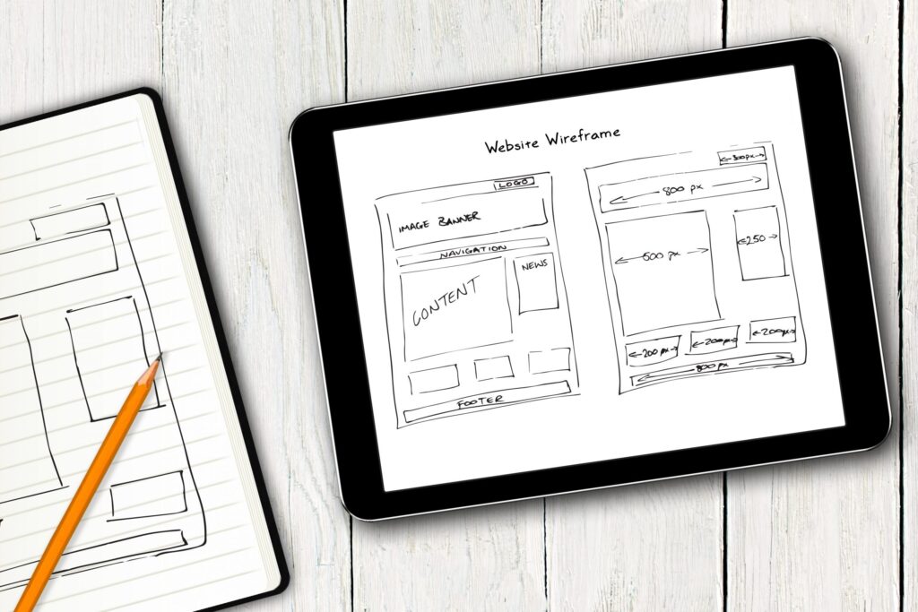
4. Wireframing Your Layout
Before jumping straight into design mode, you should probably wireframe it out first. Wireframe basically is a blueprint that shows how your webpage is going to look in its barest form as opposed to with any kind of design. You may download a wireframing program like Figma or Sketch or even use a pen for it. These are what you will include in the wireframe:
Header: This section usually contains at least the logo, navigation menu, and possibly a search bar.
Main Content Area: This is where the greater portion of your content would be. Depending on your layout plan, it could be a single column or divided into multiple columns.
Sidebar (optional): If your site has a sidebar, this is where additional content like links, advertisements, or call to action buttons can go.
Footer: The footer typically contains contact information, social media links, or site maps.
At this point, just think about how you’re going to organize it without color and font. So that if it is already laid out, you can go on to the final visual design.
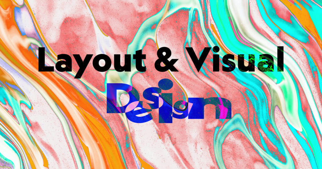
5. The Visual Design and Style
Now, it’s time to animate the wires into life. The following items are those which should be focused on getting your design in place:
Typography: Choosing readable fonts would create a strong hierarchy within the text e.g. headlines with larger size, body copy with smaller text.
Scheme of Color: Get some colors that better reflect your brand/message. Make texts readable against their background and make sure there is enough contrast between the colors.
Graphics and Images: Have affluent images and graphics that complement your content. The visuals should be associated with your message and should help partition big lines of texts.
Whitespace: Do not overcrowd your layout. Adequate whitespace is essential for making your design clearer and professional.
Covering much of Adobe XD, Figma, or Canva for setting how the visual design is, once your layout is set.
6. Think in terms of User Experience (UX)
A good layout just doesn’t depend on what it looks like; it has something to do with how the whole process works. Remember these UX principles in the layout that you design:
Navigation: Let users get what they are looking for in the shortest time possible. Clear and intuitive navigation is a great contribution to a positive experience.
Responsive Design: Your layout should adapt without problems to other screen sizes. Today, many people browse on their mobile devices. Hence, your website must be up to their viewing capability.
Loading Speed: Optimize those design elements not to slow down progress in page load times. Compressed images, minified code, and good hosting are useful for speeding up

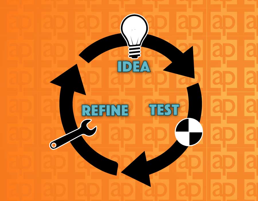
7. Testing and Refining Your Layout
When your layout is made, the next phase is to put it into test. Using analytical tools, or heatmap tracking- seeing where users are clicking, scrolling, or bouncing can reveal lots of information. It is also imperative to perform an A/B test on two versions of the layout to find out which one performs better.
Feedback can be solicited from friends or colleagues or from any actual potential user for some insight from outside your design. Just be prepared for a round of changes that may have to go back to accommodate more usability.
8. Implement the Design
Here comes the implementation of the design after testing and refining. This means converting your design into coded language, namely HTML, CSS, JavaScript, etc.; or, simply if you are not versed in coding through website builders like WordPress, Wix, or Squarespace.
Should you work with a developer; the design files and wireframes should be shared with her/him for the exact realization of the site.
Conclusion:
An arrangement for a web design layout requires a mix of creativity, structure, and strategy. Defining your website’s purpose and testing with the end product is very critical for an effective web layout. A rule of thumb state that the layout should serve the end user while helping you meet your business and/or personal goals. Lastly, go for simple, intuitive, and responsive design to ensure a pleasant interaction of users with your website. more details